sign worth displaying is a sign designed right. A sign should create awareness, reinforce a brand, and be easy to read and straightforward to follow.
A sign worth displaying is a sign designed right.
A sign should create awareness, reinforce a brand, and be easy to read and straightforward to follow. (Also Read: 99 Ways to Boost Your Business with Signs and Displays in 2020)
Before you begin, you need to have very clear answers to three important questions?
Whose attention do you wish to attract?
Take into consideration how far away they will be from the sign and the length of time they will have to read what’s on it.
What’s your message?
Take into consideration how this fits in with your brand and how you can ensure the design is consistent with your brand identity.
Where will your sign be displayed?
Once you have determined these factors, you can begin the design process and begin. Here are some tips to get you started:
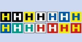
Colour is very important. Here are the best combinations for optimum readability
Readers can comprehend words on a sign better with fonts that make individual letters distinguishable.
The power of full-colour images is unmistakable. They grab your customers’ attention and instantly bring their focus to your product or service. That said…
Design for your market.
According to a recent survey by FedEx, 64 percent of millennial small-business owners (age 18 to 34) place value on creativity in graphics and signage. In contrast, their baby boomer counterparts (age 55 and older) place a higher emphasis on simplistic designs.
And whatever you do, avoid at all costs:
Mixed messages
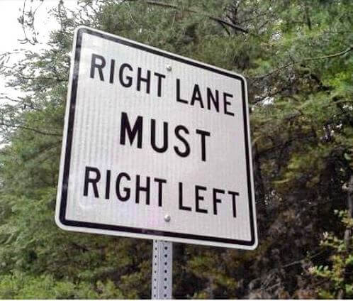
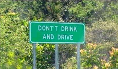
Copy errors
Unintended irony
Information overload
Forgetting other uses of the space